styled-components and CSS Variables
styled-components is a great library for styling React applications. What I like most about it is that I can keep both component and its styles in a "scoped" manner where I easily have access to the CSS rules being applied and I don't have to worry about CSS Specificity or even deleting styles that could break something else in an application.
One might not struggle styling an app when development has just started, but in the long run having to maintain and "babysit" long stylesheet files is a complete nightmare. We are never 100% sure if a certain CSS rule can be deleted from a codebase with several components (believe me, I've been there 😥).
Another great developer experience I'd like to highlight is how easy it is to add different themes to an application with just a few lines of code. That's very handy and achievable these days with the use of CSS variables.
If you have never heard of CSS Variables (or Custom properties) before, think of "global" CSS variables that are defined and available to be reused across an entire website.
The notation is usually something like --primary-color: red; and are accessed with the var() function as in color: var(--primary-color);.
From this point on, every CSS rule that makes use of var(--primary-color) will be parsed and assigned by the browser with its reference value, in this case red.
Creating global styles with styled-components
import { createGlobalStyle, css } from 'styled-components'

const theme = css`
  :root,
  .light-theme {
    --primary-color: #ff0000;
    --primary-bg: #fff;
  }

  .dark-theme {
    --primary-color: #ff0000;
    --primary-bg: #212121;
  }
`

const GlobalStyles = createGlobalStyle(theme)
This is the basic definition of CSS variables via styled-components.
:root will be the default theme unless .dark-theme is applied to overrule its two variables, creating in this case a "dark mode" theme.
Component definition
import styled from 'styled-components'

const Button = styled.button`
  background: var(--primary-bg);
  border-radius: 3px;
  border: 2px solid var(--primary-color);
  color: var(--primary-color);
  cursor: pointer;
  font-size: 1em;
  margin: 0;
  outline: none;
  padding: 0.25em 1em;
`
We can now create a Button component and apply styles as needed but also taking advantage of the two CSS variables for its background and color.
I've prepared a simple example in this codesandbox in case you want to have a look and see CSS variables in action.
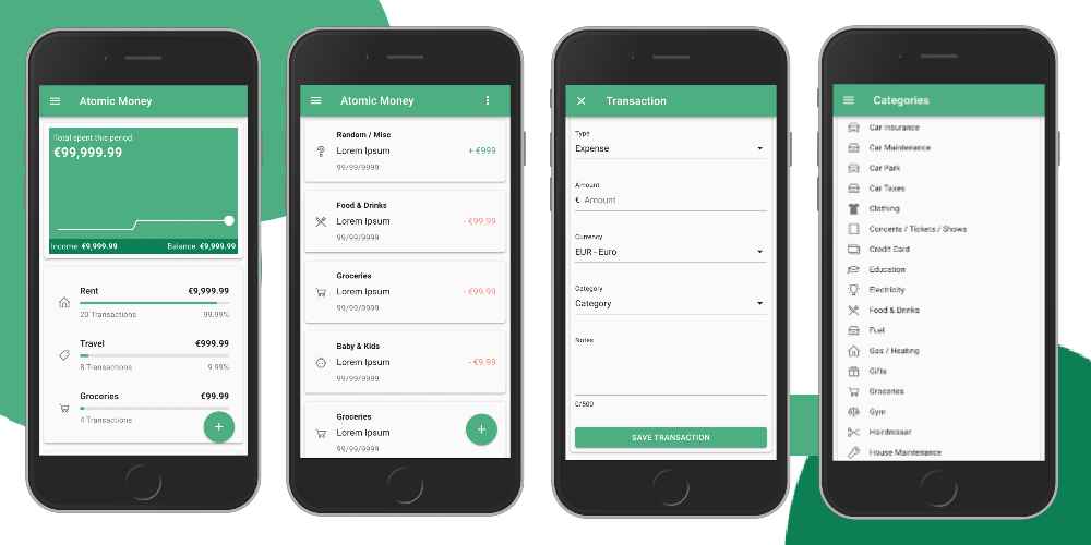
I'm heavily using CSS variables in this blog (see for yourself and turn on/off the dark mode available at the top right corner of the page) and also in my side project, Atomic Money.
If you are new to my blog or don't know Atomic Money yet, it's an expense tracker I built a while ago where I currently use as my main playground for trying out new tech, improve some of my skills and level up my career.
Feel free to check it out and give me feedback! It's completely free!
Edit
I have recently migrated my blog to Tailwind CSS but the concept of tweaking CSS Variables stays the same.
Did you know you can help me with this page?
If you see something wrong, think this page needs clarification, you found a typo or any other suggestion you might have feel free to open a PR and I will take care of the rest.
My entire site is available to edit on GitHub and all contributions are very welcome 🤙🏼.

Hemerson Carlin, also known as mersocarlin, is passionate and resourceful full-stack Software Engineer with 10+ years of experience focused on agile development, architecture and team building.
This is the space to share the things he likes, a couple of ideas and some of his work.